The apple branch
Why an apple branch belongs at the heart of Idlewind Acres.
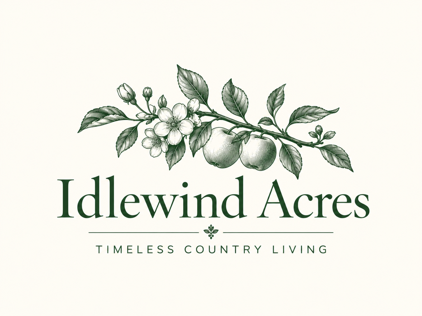
Shop this department ↓The apple branch belongs on the masthead. Its shape brings together the things we want Idlewind Acres to hold: a garden, an orchard, an affection for botanical drawing, and a little formality.
In the wordmark, blossom and fruit share the same stem. The leaves turn in different directions, the branch has a slight lean, and the fine lines give the green its depth. It is detailed enough to look at closely and recognizable enough to become familiar.
A mark to return to
We want the branch to have a life beyond the top of a page. On a label, a piece of stationery, or a future object for the home, it should feel like the same Idlewind Acres even when the full name is absent.
That gives The Orchards a particular place in the journal. Apples are part of the brand’s visual language, with room for actual orchard stories as the collection develops. The first step is this branch: green on a pale ground, with enough character to stand on its own.